Buttons and Non-text contrast
Background
A few years ago I wrote a blog about Non-text contrast much like this one.
The sentiment of that article was that the “wiggle room” relating to context within the WCAG criterion is:
- often used to justify choices that are not made with inclusivity at heart
- almost impossible to design for, if the Buttons are designed and built out of context — such as in a design system
My stance was, you should spend less time debating it and just make your buttons have a meaningful 3:1 contrast with whatever background they are on. And when I say meaningful, it’s that they look like a button, and can’t be confused with something else.
At the time I believe I missed the example on the Non-text contrast criterion that was specifically relating to Buttons:
A button which has a distinguishing indicator such as position, text style, or context does not need a contrasting visual indicator to show that it is a button, although some users are likely to identify a button with an outline that meets contrast requirements more easily.
If we take our time with this statement, what is classed as a distinguishing indicator is not defined. It says “such as position, text style or context” leaving it somewhat up to the designer or reviewer to decide what they think is enough to distinguish this element.
It also ends with a statement that a visual indicator, such as an outline (showing the hit area) could be beneficial.
From the “Boundaries” section it states:
This success criterion does not require that controls have a visual boundary indicating the hit area, but if the visual indicator of the control is the only way to identify the control, then that indicator must have sufficient contrast.
I still stand by that I believe a visible hit area is probably one of the best ways to be able to identify a Button, but I also appreciate that this is perhaps not a rule that can be applied universally.
Native app conventions
Before we go any further, it’s worth mentioning a lot of debate around this criterion is had in relation to the lower emphasis buttons in Native operating systems. Sometimes this is actually about designing for native but more often, it’s about the influence of native design patterns generally — for example using them on the web.
iOS and Android have multiple button types that do not have a visible (over 3:1) boundary. All of the examples below apart from the filled button rely on the icon and content to determine interactivity.

Likewise the “Tonal” and “Text” buttons in Material Design 3 do not have any visible hit area (above 3:1) or, as far as I can tell any other visual indicator. You can see the text button in use, just as text with no icon in Google apps right now.

In the earlier versions of Material Design the Buttons were all in uppercase. While this potentially has its own issues, text style would be considered as much of a distinguishing indicator in this example as something like an underline, background or border.
A user can determine what elements are interactive just because they are the only elements in uppercase.

The reason I mention Native and indeed “Text” buttons is that we often do need consider these decisons from a cross-platform design language perspective. Not just web or native.
Enhancing WCAG with your own rules
If we generally want to follow the spirit of the Non-text contrast guidance, but also accept it’s not something that can be applied universally then some specific guidance is needed.
If we can’t always understand the context in which Buttons (or in fact the<button> element itself) might be used then we need to add more context to our components and guidance themselves.
Maybe this guidance is just for a design system team, maybe it’s for your entire org but the aim is the same.
Have a clear and consistent approach to non-text contrast of Buttons.
This is an approach I’m happy with, you may choose a different one.
The three tier approach (TLDR; version)
- “Standalone” Primary / Secondary (or normal) actions must have a visible hit area of 3:1
- Tertiary actions do not require a visible hit area but must contain an additional element or style to denote interactivity
- Integrated actions, such as a button element inside another component, can rely on context or foreground elements to denote interactivity
The three tier approach (Slightly longer version)
“Standalone” Primary / Secondary buttons
Mid to High level standalone actions (such as Primary, Secondary/Normal, Destructive) must have a visual hit area that meets a minimum of 3:1 achieved through either background colour or border.
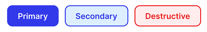
The term standalone in this context is used for ‘call to actions’ that exist on their own or grouped with each other. They are not integrated within another UI element, they exist as their own specific action or action group. For example “Continue” or “Cancel” in forms.
The intent behind this is that most Buttons on any given page or screen have a visual hit area indicator that exceeds 3:1 contrast.
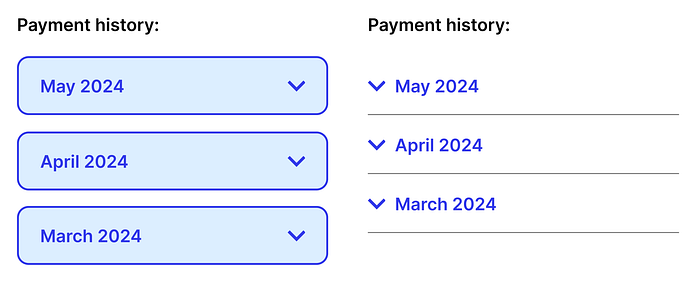
Tertiary buttons
Tertiary buttons (Including all low contrast native components mentioned above in this category) can have the same visual prominence of a Text Link.
They do not require a visible hit area providing the element can be identified from regular text through a combination of at least two of the following:
- A text underline
- An appropriate icon
- Contextual content
- Font weight or style

Integrated actions
An integrated action is simply when a Button or Button-like element is used within another component. In this case, the need for a visible hit area or identifier should be considered against the design of the component as a whole.
In some instances, the amount of controls in an element may affect comprehension, or put the emphasis in the wrong place.
A simple example might be an Accordion component. It’s highly likely that an HTML <button> element would be used to build this, but it may not be desirable to make each section have a visible hit area with the same emphasis a button would have. After all, an accordion is really more about adding a behaviour to structured text content. It would likely be styled more like a heading.
The example on the left shows an accordion with a visible boundary. While this design may actually be appropriate in some cases (such as a single floating accordion), the design on the right gives context through the icon and position, grouping and separators and may be more appropriate to integrate within text content. It doesn’t require the hit area to be defined.
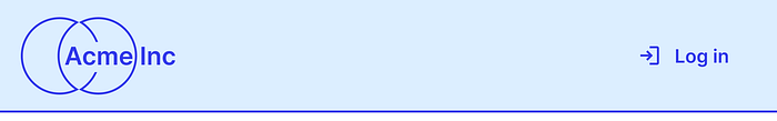
Another simple one might be how buttons or links are styled in a header, footer or menu as opposed to within page content. The affordance level required of the actions could be determined by the parent element, not the elements themselves.
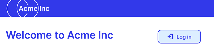
Here’s an example of a log in button integrated inside a header. In this instance the header itself will be at the top of the page, has been given a visible boundary to emphasise what’s contained inside of it and the button has been given a corresponding icon. Because of this there is less need to have a visible boundary on the button itself.
If the log in button was not contained in the header, it would no longer be integrated. Following the guidance set out above, this would become a standalone action and require a visible hit area.
A slightly more complex example might be a larger component with multiple actions inside of it. Perhaps we think about the notorious enemy of design systems teams everywhere — the calendar control.
In this component, it would be more beneficial to lean on context and layout to benefit the usability as a whole.
The design on the left is an intentionally extreme example of all button elements in a calendar control having a visible hit area of 3:1. It adds a considerable amount of visual clutter and potentially makes the entire component harder to understand. Not to mention, it’s going to become a lot harder to design a meaningful focus state, selected date or current date when every element already has this much visual prominence.
The design on the right hand side re-address the balance of the component to focus on the task itself.
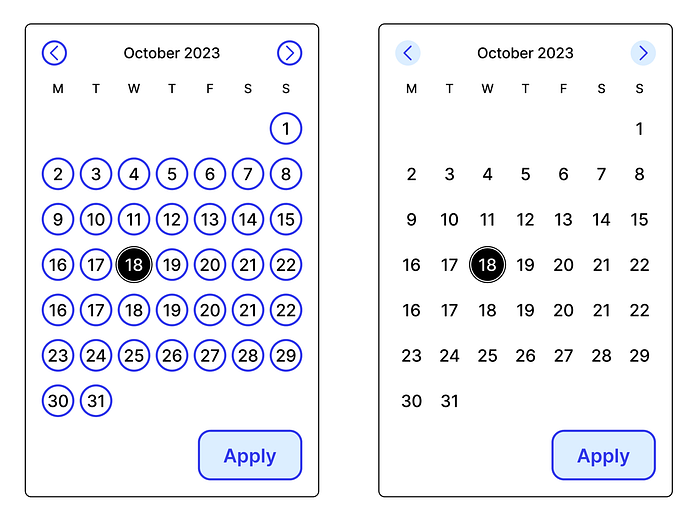
The caveat to all of this, this is being suggested as a minimum acceptable standard. A contrasting element over 3:1 would always be encouraged unless adding this makes the interface harder to understand.
Summary
Some of this may feel obvious, but because the Non-text contrast criterion cannot possibly cover every eventuality, without having some additional guidelines in place you may find yourself having a lot of the same conversations over and over again and again.
A framework like this should remove some of the ambiguity of the guidelines and hopefully encourage the most common and important Buttons to meet a minimum of 3:1.
