Why debate non-text contrast of UI elements?
TLDR; Stop debating if any particular UI element “needs to comply” with WGAG 2.1- Non-text contrast and just do it.
It’s been a few years since WCAG 2.1 was published and one point that causes more discussion than any other in my circles has been Non-Text contrast.
What is non-text contrast?
The spec says:
Success Criterion 1.4.11 Non-text Contrast (Level AA): The visual presentation of the following have a contrast ratio of at least 3:1 against adjacent color(s):
User Interface Components
Visual information required to identify user interface components and states, except for inactive components or where the appearance of the component is determined by the user agent and not modified by the author;
(I’m only focussing on UI components in this blog but there are additional considerations for “Graphical objects”, for example charts or diagrams.)
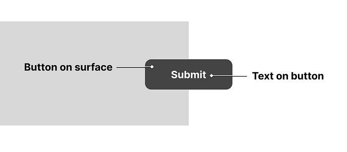
An over simplification might be to say, if you design a button, the label on the button should meet a minimum of 4.5:1 (Text contrast) against the button background and the button background colour (or border etc) should meet a minimum of 3:1 (Non-text contrast) with any surface it’s placed on.

I wrote a simplified version of the spec for myself and the team I work in:
Make sure elements that can be interacted with or contain essential information are recognisable to people with low vision.
The parts of the visual presentation of an element that make it understandable need to have at least a 3:1 contrast ratio with the background they appear on.
This forced me to consider what makes an element recognisable or understandable. This is of course open to interpretation and the context in which an element is presented.
The exceptions in the guidance
Every time I see someone rightfully point out that perhaps a very light grey outline for text inputs on a white background may indeed not be accessible they often get a response like — “UI elements don’t need to meet this requirement”.
Ignoring the fact that meeting or not meeting WCAG 2.1 should not really be the consideration here, strictly speaking this can be both correct and incorrect based on context — whether that be content, proximity or something else.
The WCAG 2.1 guidance gives some examples where the contrast ratio of 3:1 does not need to be met to pass this criterion.
This success criterion does not require that controls have a visual boundary indicating the hit area, but if the visual indicator of the control is the only way to identify the control, then that indicator must have sufficient contrast. If text (or an icon) within a button or placeholder text inside a text input is visible and there is no visual indication of the hit area then the Success Criterion is passed
I personally take “if the visual indicator of the control is the only way to identify the control, then that indicator must have sufficient contrast” to mean that an element needs to be recognisable as that element.
Well this for me is the grey area…context.
Following this to the letter, text at the end of a form that says “Submit” by this standard gives users enough context that this interaction will result in their form being submitted. Therefore it does not technically need to meet 3:1 contrast for background colour, border or any other visual indicator.

Likewise, despite the fact using placeholder text for form inputs is not considered good practice, this is also suggested as enough context for form inputs to not need to meet 3:1 contrast ratio (providing the placeholders meet 4.5:1).
If text (or an icon) within a button or placeholder text inside a text input is visible and there is no visual indication of the hit area then the Success Criterion is passed
So let’s just say we design a small form that intentionally has bad contrast on the borders of the text inputs and the background of the button:

For a user that could only see the design on the right hand side of this screenshot I would not personally consider these elements as “identifiable”. This is because they are not identifiable as the UI elements they are, certainly not without any doubt.
What makes something identifiable?
I’ve gone back to the line “if the visual indicator of the control is the only way to identify the control, then that indicator must have sufficient contrast” and debate its meaning back and forth a number of times.
What makes a button identifiable? What makes an input identifiable?
Having an element that can be simply identified is not enough. It should be identifiable to the point that the user knows how and where to interact with it and ideally what’s going to happen when they do.
A design system problem
Some of these fundamental UI elements are now likely to be the responsibility of a design system team. One thing that a design system team does not have is the foresight of every possible context in which it’s going to be used.
For example, the “invisible” button design from earlier in this blog might not actually cause any barriers in the context of that form, but what if a designer uses this button in a position that is less logical to a user? Could a user just think it’s a heading or some random text?
This is why I treat non-text contrast as a hard rule to follow, context or not. All interactive UI elements should meet 3:1 in the parts of the design that make them understandable, not just recognisable.
This doesn’t mean every single element of the design needs to meet 3:1 contrast. What’s important is that the elements of the design make it understandable do and this will be different for every element you design.
My challenge to you
Every time you design or build something, take 10 minutes to review it with all the parts of the interactive UI elements that do not meet 3:1 contrast ratio removed.
So if your button background does not meet 3:1 remove it, if your interactive card borders do not meet 3:1 remove them…
Then ask yourself:
- Is the interface still understandable?
- Is the interface still as usable?
- Could I do more?
If you find you could be doing better, that’s a good thing. You can do something about it.
I followed this process for 5 minutes with the landing page of the two biggest websites in the world. Here are the before and after screenshots:
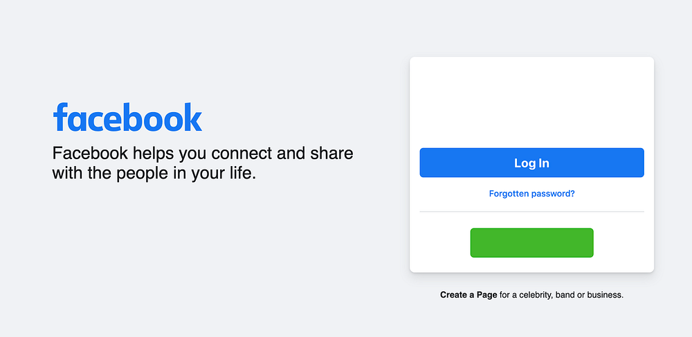
Here’s the home page of Facebook. The primary action would be to log in or create an account.

And here’s the same page with the interactive UI elements that do not meet 3:1 contrast removed. There are no visible form inputs to enter your username and password. The “create new account” button label did not meet text contrast requirements so that was also removed.

Here’s Googles landing page. The primary action is to use the search bar and conduct a search.

And here’s the same page with the with the interactive UI elements that do not meet 3:1 contrast removed. That’s right, it’s a similar story. The search bar and search icon has vanished and the buttons underneath no longer have a background colour.

While removing these elements entirely is debatably more dramatic than the true to life experience someone with low vision might experience, it brings home the importance of having contrast requirements on UI elements.
I don’t use examples like this to name and shame but purely to show how common an issue this is all the way from the biggest businesses right down to startups.
Follow the sentiment behind Non-text contrast and just make things that a user needs to interact with recognisable to all. They are often the most important things on the screen.
